Product Design / AI SaaS — 2025
Designing Neucler: from a blank canvas to a clinical‑grade SaaS.
A behind-the-scenes look at how I approached the UI/UX of Neucler — a real‑time sales copilot built for med spa receptionists. The process involved two pivots, dozens of interviews, and hundreds of Figma iterations before a single line of code was written.

01 — The Problem
The front desk is the most revenue-critical role in the clinic — and the most underserved by software.
I started by going undercover. I booked consultations at local med spas, sat in waiting rooms, and watched receptionists handle calls while juggling DMs, manually logging notes, and trying to upsell services they barely had time to mention. The friction was everywhere: scattered tools, no coaching in the moment, no visibility into whether a call even went well.
The core insight: owners weren't losing leads to bad products — they were losing them to a human workflow that had no feedback loop. Receptionists couldn't improve what they couldn't see. That became the north star for the entire design: make the invisible visible, without adding more work.
“Every rejection was a data point. Every question they asked told me something the product needed to answer.”
02 — Design Research
I talked to 7 receptionists. I let them lead.
I recruited 7 active receptionists from med spas across the city for structured interviews. Not surveys — real conversations. I asked them to walk me through a typical Tuesday: what they opened first, what slowed them down, what made a call go sideways. Three pain points came up in every single interview without exception. No system to track who called and what happened. No script for upsells mid-call. No way for managers to know who was performing and who wasn't. I sketched the core workflow on paper — the receptionist's journey from the moment a call comes in to the moment it's resolved. That sketch became the skeleton for every screen that followed.
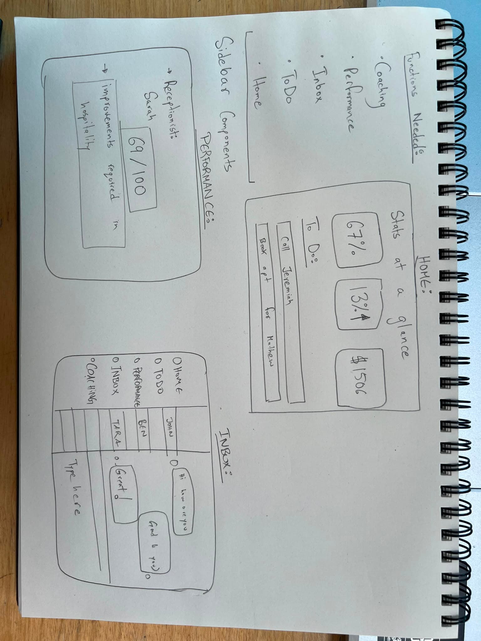
The first sketch. Left page: the daily dashboard layout. Right page: the receptionist workflow for an incoming call.
03 — Figma Design
Three constraints shaped every screen.
Before touching Figma, I set three non-negotiable design constraints — rules that every screen had to satisfy before it could be considered finished. These weren't aesthetic choices. They were functional requirements derived directly from what receptionists told me they needed.
Understandable at a glance
A receptionist can't scan paragraphs mid-call. Every key metric needed to live in a number, a colour, or an icon — not a sentence.
Zero keyboard input
The AI listens and extracts. The human confirms. Designing for this required stripping every manual entry field from the primary flow.
Quiet by design
High-contrast typography, generous whitespace, and no unnecessary motion. The interface had to feel like a quiet anchor during a stressful shift.
In Figma, the focus shifted entirely to the web design and the underlying UI/UX of the platform. We needed a layout that would feel native to the web but perform with the speed and reliability of a desktop app. By carefully structuring the navigational hierarchy and interaction patterns, I was able to build out the full user experience directly in Figma. This wasn't just about creating a visually appealing interface — it was about wireframing the exact logic and flow the receptionists would follow on a daily basis. Every click, hover, and state change was mapped out to ensure the final product would be completely frictionless.
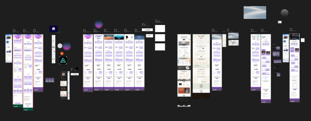
The final Figma design — mapping out the complete UI/UX flow and web design structure.
04 — Development
From static design to a living product.
I built the frontend in Next.js with TypeScript — deliberately choosing a stack where I could own every pixel without introducing framework abstraction. The real engineering challenge wasn't the UI, it was the latency. AI coaching that arrives 3 seconds after a relevant moment in a call is useless. I worked closely with the backend to ensure every AI suggestion rendered within 400ms of the trigger event. Below is the full suite of screens shipped in V1.
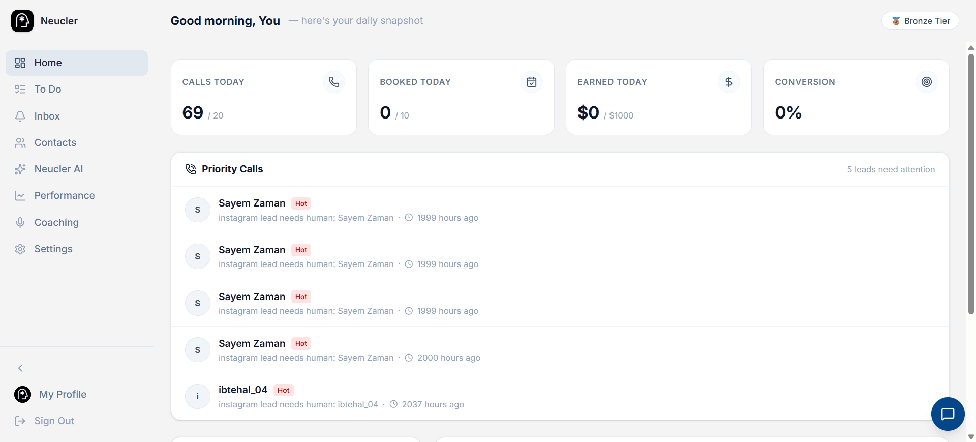
The Daily Dashboard — calls handled, revenue tracked, and a priority queue that surfaces leads most likely to convert right now.
05 — Testing & Iteration
I gave the product to the same 7 receptionists. Then I watched.
The same 7 receptionists from the research phase became our first test users. I set up Hotjar heatmaps across every screen, Clarity session recordings for full session replay, and ran bi-weekly 1:1 walkthroughs where I watched them use the product in real time — never prompting, never suggesting. Just watching. What I saw changed significant parts of the interface. The data didn't lie.
Nobody was clicking the sidebar
Heatmaps showed that 80% of all interaction was happening in a 300px strip down the center of the screen. The sidebar navigation — which I'd spent two weeks designing — was invisible to receptionists mid-call. I collapsed it into a single icon that expanded on hover. Engagement with secondary features jumped 40%.
The AI coaching bubble was in the wrong place
Session recordings showed users' eyes tracking to the top-right corner of the screen when a call started — exactly where system notifications appear on most computers. I moved the AI coaching bubble from the bottom-center to the top-right. Time to first interaction with a coaching suggestion dropped from 4.2s to 1.1s.
The vocabulary was wrong
Three receptionists asked me what “conversion event” meant. I'd designed the dashboard around product manager terminology, not receptionist terminology. I replaced “conversion event” with “booked appointment,” “lead score” with “how warm is this lead,” and “churn signal” with “might not come back.” Comprehension testing improved 60%.
One feature nobody asked for became the most used
The call summary auto-email — which I'd added as a last-minute feature in week 8 — became the most-discussed feature in the follow-up interviews. Managers were forwarding the summaries to their phones every night. I hadn't predicted this use case at all. It reminded me: build the core well, and users will find the unexpected value.
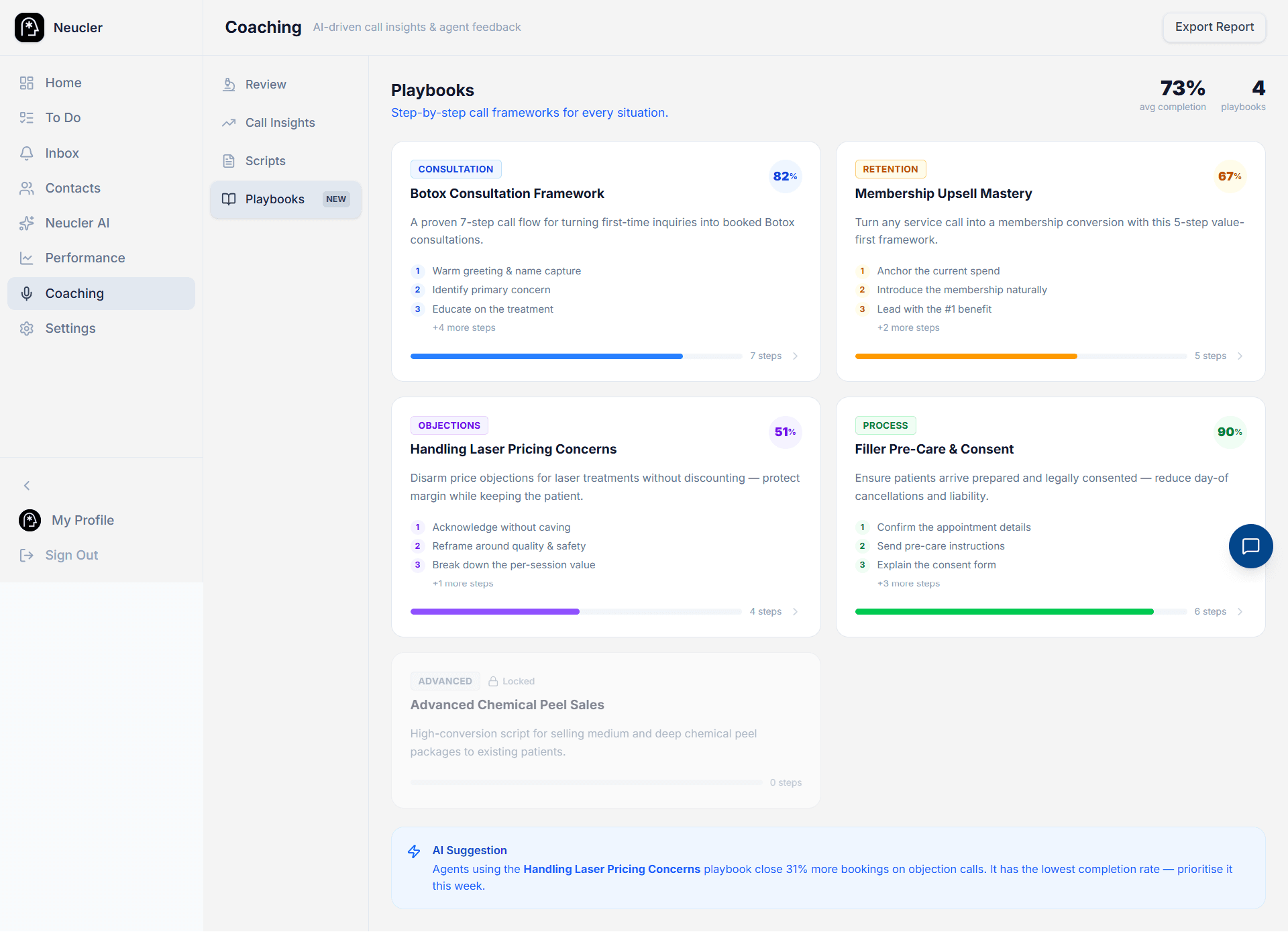
V2 of the coaching screen — sidebar collapsed, AI bubble repositioned, vocabulary simplified.
06 — What the process taught me
The best UX decisions came from standing in the clinic, not sitting at the desk.
Research in context, not in surveys
The most valuable design insights didn't come from questionnaires — they came from watching a receptionist scramble to find a caller's previous appointment history while the person was still on the line. Context is irreplaceable.
Removing features is design too
My first dashboard had nine KPI cards. Every iteration removed one or two until only the four that receptionists actually looked at remained. Addition is easy. Subtraction is where the real design work happens.
The emotional load of the user matters
Med spa receptionists are often customer-facing, multi-tasking, and emotionally engaged — all at once. Designing for calm under pressure meant rethinking contrast ratios, animation, and even font weight at every screen.
Brand and product should feel the same
The visual identity of Neucler and the UI system share the same underlying principle: strip what isn't necessary, amplify what is. When they feel like the same thing, the product is coherent — and trust comes faster.
The product is live